Tuesday, December 7, 2010

Candyland Design

Unfortunately I was absent when we were told to do this, so it's a little late...
When I was first given this project I honestly was coming up blank. I didn't know what I wanted to do... I just kept thinking of how bright the newer version is and how over done it is and so loud and way too much is going on on the bored. I didn't like this one bit, so my first thought from the beginning, was bringing it down and bringing it back a little to when it wasn't so bright and loud but still playful enough that the kids were attracted to it and wanted to play with it.

I was having a hard time coming up with character ideas, due to characters not being my forte I really didn't know what I wanted to do. After actually talking to my 8 year old sister and doing some research of course I came up with the idea of bringing back mr. mint, I wanted to change lord licorice to lord sour (making all candy sour tasting). I wanted to have an ice cream man ( like a snowman, but ice cream) I also wanted to keep lolly and princess frostine cause those were characters that have always been consistent... other candies I wanted to bring in was marshmallows, cupcakes, a really big cake, donuts and all other different kinds of treats that kids always love to get.

I changed up the board spots using originally a gumball idea but looked more like the dot candy and that circle, instead of the original square. I then wanted to use different pieces of candy and instead of just making them the same and just different colors I wanted to try to incorporate the different places as my pawn pieces instead of just one item a different color.

Monday, December 6, 2010

Fax Show

Cat in the Hat


For my candyland project I am doing a Dr.Seuss theme. While I was going through some images for the project I found this one. I like it because it's clearly the cat in the hat, but it's almost like he is from some alternate universe. He is nothing like the real character. He is dark and a little creepy, especially with the eye in his stomach. I'm not really sure why that is there but it is very strange. Also the sceene in the background is something from one of the books, but it's missing the cheerfulness of the real thing just like the cat it.

Monday, November 29, 2010

Candy Land

When first presented with Candy Land many ideas started going through my head. I looked into Candy Land further to see if any of them were possible. When I saw that there was a Dora the Explorer I realized my idea was possible. I am making Rocko's Modern Life Candy Land. As a child I would watch Rocko all the time. Though it is not "educational" I feel that is kid friendly through the different "cartoony" characters. My color scheme derives from different colors within my main characters.

My pieces that move around the board will include;
  • Rocko
  • Heffer
  • Filburt
  • Spunky
The places to go around the board will include:
  • Mr. & Mrs. Bighead
  • Peaches
  • Chameleon Brothers
  • Mr. Smitty
  • Hippo Lady
  • Really Really Big Man (to win the game)
  • Dr. Hutchinson
Each character will have some type of candy. I am modeling mine off one of the older games which has 3 spots where you get stuck (Gooey Gumdrops, Lost in Lollipop Woods, and Stuck in Molasses Swamp). My locations will all relate to the candy that is with each character in that general area. My colors are more of pastels instead of the more vibrant primary colors.

Sunday, November 28, 2010

design brief

So my idea is to have a holiday version of candyland. I want to focus on all the holidays during the year, using the characters to represent the figures throughout the game. It is candyland, so each character will have candies or sweeties around them, ones that are usually around during that holiday or time of year. The background will be scenic settings, each season will be shown throughout the game board. The pathway will be the same design as the original candyland games, with different colors on each block. I'm still thinking about my game pieces, but I believe they will be children or elves.
My characters will be Santa Claus, Mrs. Claus representing christmas time and their sweeties will be cookies, milk, and candy canes. During the fall season of the game, I will have a turkey character for thanksgiving with a candy corn mountain. In the original candyland games, one character is usually a villain that can send you backwards in the game, so to represent Halloween, I will have a scary pumpkin as the villain. My other characters include Cupid, Easter Bunny, maybe a groundhog, an american flag character for our independence day. We talked in class about other holidays represented by different cultures and religions, so I may also have other holidays such as Hanukkah, Kwanzaa, Chinese new year,or cinco de mayo. I related to these characters when I was younger and I think kids will have fun with the game and it could also be educational.

Friday, November 26, 2010

Holography

Surprisingly there aren't many artists working with holographic plates, although not surprisingly it is very expensive, so it's no wonder. The process requires a laser, the actual holographic plates, a dark room, some development chemicals, and of course the object or thing you want to holograph. It's amazing what can be done, and I could think of many applications for this process, however, it's greatly limited by the availability of large enough holographic plates or space to holograph the object. There is essentially a 1:1 ratio on size of object and the holographic plate itself, which obviously results in a scaling of price. However there are a number of artists working with this medium, here is a small list of artists and some of their work.

http://www.physics.ohio-state.edu/~kagan/holo_pics/holo_artists.html

Candyland Brief

Design Brief For Candyland


My overall concept will be elemental, in reference to the actual confections
themselves and the scenerey I will use, such as volcanoes, mesas, islands.
There will also be an underlying theme of the elements of the universe,
such as fire, earth, air water, metal, stone, wood, etc. I considered
using actual products such as Snickers or Reese's in the board, however I
didn't want it to feel like an advertisement since that diminishes the
spirit of the game. Instead I decided to focus more on ingredients and
generalized forms of candy such as mallow, chocolate, peanut
butter/peanuts, caramel, ice cream, licorice and sugar. Included with each
of these representations there will be references to where the ingredient
comes from, or part of the process of how its made, or who helped create
it. For example, a character I have representing peanuts and peanut butter
will be Sir Carver of Castle Le Gume. Sir carver will have an impaled
peanut on his sword in front of a castle full of peanuts. I want the
representation to say "Peanuts" while also giving way to curiosity about
the name Carver and Le Gume. I want to provide insights where possible so
that adults and children can learn something from the game. Instead of
trying to push people to eat more candy I wanted to provide a neutral
ground where it doesn't feel aggressive in it's advertisement of candy,
but also provide some minor educational benefits.

My game will have a lot of soft, animated and mostly cartoonish imagery.
However I will include a lot of shading to create more 3D elements
throughout the game to reflect our current standard of minor realism. For
example, the Taffy Factory will not be a flat 2 dimensional object, it
will stretch according to perspective. Many of the elements I will use
will be perspective based, will have shadows and shading to create a
slightly cartoonish viscera. As the pieces move through the board, they
will encounter areas such as the Sticky Fields where they will get stuck,
or the Licorice Copse/Forest where the player will get lost. There will
also be the traditional bridges between parts of the track. Also, I had a
chance to look at the newest Candyland, and was almost shocked to see how
insanely busy it is and how it almost reflects the ADDism of recent and
contemporary generations. My board will be less visually cluttered than the
current board as a result of seeing the messiness of the newest board.

Overall my intent will be placed on appealing to a large demographic, and
I am borrowing the idea of cartoon style with adult content from such
companies as Pixar and Disney, who offer entertainment that is simple
enough for kids to follow, but provides some sort of insight into wisdom
and understanding of the origins and processes of candy.

Wednesday, November 24, 2010

Comic Book - Candyland

For my Candyland design I am going for a comic book theme. Rather than the traditional comic book style however I am going to try to make my designs more kid friendly by adding vibrant colors to my hand drawn characters. So far I have developed a color scheme (red, orange, yellow, green, blue, purple) along with the CMYK numbers to plan out the pathway for the base of the game board.
As of now I am working with a combination of ideas from the 1990's version and the latest 2010 version to come up with ideas for candy choices along with the character ideas to go along with them.
- cupcake castle (princess- goal)
- fire ball (devil- villain)
- mint mountain (fairy)
- freeze pop forest (raining gum balls, frog)
- lollypop land (lizard)
- ice cream creek
- gummy bear lane (bears)
- gingerbread house (grandma's cookies)

My playing pieces are going to be a children in simple outfits two boys and two girls. (yellow, green, blue or red)

Halloween Candyland

My Candyland game is going to be Halloween themed. The board will follow the traditional path with an altered color scheme consisting of dark, but vibrant, shades of yellow, teal, purple, orange, magenta and kelly green. They will be on a dark, "almost-but-not-quite-black" grey. My illustrations are going to be friendly and cartoony, without being too heavy or boldly outlined. They are inspired by the work of Alberto Cerriteno, as seen in this piece here.

My gamepieces are going to be children wearing iconic Halloween costumes: A witch, a ghost, a clown, and acprincess. They will be done in the existing style of the gamepieces, a solid piece of plastic (large enough to not be a choking hazard), but I will be updating the colors to match the scheme I have. On the board, the candy spaces will still be candy, only a bit more "Halloweeny" (like candy corn, gummy worms, fun size candy bars, taffy, lollipops, and possibly caramel apples and pennies, which are clearly not candy but still popular halloween "treats") The accompanying characters will be either adults in goofy monster costumes or actual friendly monsters handing out candy from their homes (I've been wrestling with this idea all week, any feedback would be great. Real monsters or adults in costumes?)

The "villain" in the game is going to be a crotchety old man (who happens to be a retired dentist) that doesn't believe in Halloween and refuses to give you candy. You will waste a turn asking him for some. The goal of the game is to return to your "home" (the final space) and eat all your candy! YUM!

Tuesday, November 23, 2010

MOMOTAROU


I chose an old tale story call ‘MOMOTAROU’. There are several reasons why I chose ‘MOMOTAROU’ are: my target range for this product is for Japanese kids, the story has seven different characters, and I could combined Japanese Candy into each characters.
Firstly, this is a very famous old tale in Japan, ususally, some story is more related to girls, or some story is more related to boys, but this one is for everyone. Especially when we are child, our mother or the teacher will read to us. The details of this story is very simple. A boy call Momotarou(means a peach boy in english, because he was born from peach) decide to fight with an red ogre, and a dog, birds, and monkey also decide to go with Momotarou. However, I found that I should use some kinds of Candy for their item instead of sword.
I made two modern kindergarten kids for the bigining is because I would like to make then seems like into the fairy tale. Just like my young brother always dream he could enter the storybook. I feel like this idea will be interested for 3 years old kids.
The color I picked are earthtone color or light color. Because Japanese candy is not that colorful and I want to match with the candy, but I still used the color which the children will like it. Such as pink, and blue.

Monday, November 22, 2010

Dr. Seuss Candy Land

The theme I chose for the candy land project is Dr. Seuss. I want to take all the best known Seuss characters and place them around the board. I want the kids that would be playing the game to feel as if they are walking around in one of the books. I want the colors to match the ones found in the books, and the works and names used to sound as if they were made up by Dr. Seuss himself.

For the game pieces I will be using Thing One and Thing Two. The players will start out by passing Yertle the Turtle. They will them travel through the land of the Sneetches and the Fox in Sox. They must them tread carefully around the Grintch. Next they will encounter Sam I Am, with his Green Eggs and Ham. Finally they will pass by the Lorax and Horton the Elephant. At the end of the game they will end up meeting The Cat in the Hat.

The reason I chose Dr. Seuss is because I feel that it is a something that anyone of any age can recognize. Even children to young to read will still enjoy looking at the colors and interesting shapes and characters. I thought it would be appropriate for the age range that this game is geared towards.
The History of Candy Land

Click here to go to Hasbro's website and see the history of the board game.

Alice Melvin

I was reading through the Communication Arts website and Alice Melvin was featured on the home page. I quickly went to her site to see more of what she does. She is a great illustrator. She uses many different patterns and repetition in her designs. You can look at her work at her website.

Unique.

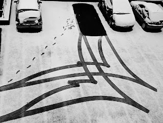
This photograph really spoke to me. It is interesting because It looks like an abstract painting, but it is really just the aftermath of a car leaving a parking spot. It amazes me that such a simple act can create such a strong image, and I love the fact that you can really understand the process that created the piece.

Monday, November 15, 2010

The fax machine ate my homework


During the process of this assignment I couldn't stop thinking about the 1999 movie, Office Space. Having been stuck in a cubical for two years selling insurance it is a movie that I can relate to. In the movie, one of the main characters was constantly having issues with the office's fax machine. He was continually receiving the message "pc load letter" from the machine. During the climax of that plot line three co-workers bring the fax machine out to an empty field and take out their aggressions with a baseball bat and a series of loafer-laden foot stomps. All of this is done with a 90's gansta' rap song for a soundtrack.
It was with this scene in mind that I came up with my idea. What would my art, and in this case my homework, look like chewed up through a less than user-friendly fax machine? To play on this concept I chose one of the worst designed Chinese restaurant menus I could find and renamed all of the items with a paper-based theme as if the fax machine itself was ordering off the menu. I also placed a spatter effect on the whole page to make it grainy. I played with a gradient to make it appear as if it didn't print out evenly. I made a logo with a fax machine and chopsticks and made my piece's title the restaurant name. I gave the appearance of a torn corner on the bottom right and topped off the page with the phrase "pc load letter" in large letters across the page.

My theory on this "fax" project, was to create something that looks like it has been deconstructed and put together as a whole. I went with the look of a bunch of Polaroids creating my face.

I believe this fax show is about the beauty in change. Since all of the artworks are being created and sent to the show through a fax machine, some details of the images are being reduced due to some information being lost each time the piece is being sent. It is hard to determine the way my final piece will come out due to the fact that it is in color, straight off the computer, and is going to be sent using an out-dated form of communication.

When I first entered the FAX show, I wasn't sure what to think. A fax machine is used to send documents to different places, in a quick and convenient way. I would never think to use this form of technology to send pieces of artwork, let alone create a whole gallery exhibit based upon this idea. But it is interesting, in a way we are creating art through the use of a fax machine. The original composition is changed when it is turning into a fax, and with whatever pieces of information that is transmitted, we get an image that becomes it's own work. This image is than reproduced again and again, changing each time. The use of the fax machine also allows many people to become involved as well as challenges the question of what art really is and who can produce it.

For my submission, I was interested in how the fax machine changes a colored image. I wondered if the work of art would effect the viewer in the same way, how the mood may change and so on. The first image is a photo I took of the Eiffel Tower that also has a strong color contrast. The second image is an impressionist painting I did of a scenic landscape. I'm also interested to see the effect that a painting has vs. a photographic image when it becomes a fax. Overall the FAX show is an interested way to communicate art in more ways than one. This show also opens the door for many people to submit different forms of art and it will be interesting to see how this exhibition progresses.

FAX


So after viewing this FAX show i was very confused to what we are calling art but this is a great way for someone to grind out work and have it be shown in black and white. It amazes me what people will fax into a show even if it's not that great. After all we don't really know what people are trying to represent with there work it's just put up by the curator and how that person wants to set it up. To think that something is in color to be turned into black and white is surprising because you don't know how things will turn out on the other end unless you go down and figure it out. The FAX show puts a whole new side to art since there is more than just images since we can use other topics and media as art. Poetry, music, dancing, the show helps me realize that there is more an art show then there really is.
For the work i put it was done in color but when it was printed out that went right out the window. There wasn't much color but the color that was there represented school colors. So i guess having this piece as a fax show changes it up with a representation from where i came from. Self portrait and portray different feeling at one moment in time.

Fax Submission

The FAX gallery really pushes the limits of the traditional views of a gallery. In place of framed paintings or prints lies a lone fax machine, and from it spews a medley of artwork that can be deemed nontraditional to say the least. The idea of a fax machine to me is something that is of little utilitarian worth now. With advancements in file sharing technology, as well as an increasing drive to have everything computer based, fax machines have become obsolete. Putting one in a gallery is breathing new life to this played-out machine, giving it a home in a world where practicality has cast it aside. There is an almost nostalgic, blast-from-the-past feeling behind it, like watching an old cartoon or finding a toy from you childhood. Granted, there is a different, much less "fun" association with a fax machine, but there is still a feeling that is hard to ignore.
For my submission, I wanted to explore the obsolete nature of the fax machine. Nowadays, if you need to share something with somebody, typically we will just upload the file somewhere and share a link. This is what my piece focuses on. It is conceptual, challenging the artist's expectations of a typical gallery visitor. I first created several graphic representations of a fax machine and posted them to popular image sharing sites (photobucket, flickr, snapfish, and dropbox), all under the title "Nostalgia." Then, for my actual fax submission, I laid out the url's for these images in a simple, straightforward manner. I also made them look weathered to illustrate the fact that, whether you are faxing or file sharing, information always has to go through several channels and pass through several hands before it gets to its final destination. My hope for this piece is that the text will be recognizable as a url and that someone will take the initiative to follow it to find the true "artwork" of my submission. However, I am also aware of the effort needed to copy an entire url by hand, and, in this day and age of copy-and-paste gratification, I am curious as to whether or not anyone will be willing to take on that task.

Here is one of my links:
(Gallery visitors won't have this luxury of course.)

Fax Show Project

When I first walked into the fax show and saw all the different things that had come through the fax It really caught my eye. I kept think how much it's like life, You go through life (going through the fax machine), thinking about life in one sense in your head, but the way it comes out isn't what you expected. Sometimes it's weird, other times your confused and just don't get it, sometimes it's funny, other times it's beautiful, and other times it's sad or makes you angry. You just don't know what you're gonna get. The quote that stuck out is the ride and enjoying the ride of life.

For this assignment I wanted to approach it as life, this big grid of life.. that you go through and you have to just sit back and enjoy it. Take it how it is. And not take it so seriously. Yeah we have our ups and downs and all that but at the end of the day you have to sit back and enjoy what you got, regardless if it's how you wanted it to come out. I did a photo shoot taking pictures of just not thinking of what you have left to do, not caring about whose around you, and just being silly, and just letting the ending results just come out and what ever happens at least you were having fun. I wanted to express the "grid" of life that you are gonna take and its curvy and has its bumps but thats life. You got your dark times, your gray times, and your happy (white and shinning and bright, that stick out) times, thats shown through the different shades. I hope you enjoy.


Freedom of Expression


The FAX show taking place in the gallery challenges the idea of What is Art? Most of the work displayed throughout the gallery really shows that art can be almost anything depending on the way the viewer looks at it. It is interesting to think that an amazing work of art can be misconstrued in the process of faxing the work from one place to another. By losing value and detail this FAX project can ruin a piece of work that once could have been incredibly interesting which makes it an interesting challenge!
When we were first given the assignment to design something that could be faxed in i thought of a lot of interesting ideas, mainly in black and white. I chose to use black and white photography to capture an interesting composition. With the limitations of only black and white ink on an 8.5 x 11 sheet of paper I needed to be creative with my final product. I decided to use 3 separate photographs and combine them together when presented in the gallery. What made this project interesting was that as different as these three images were, they had a similarity that made them work well together. Each person photographed was looking out of the frame in a different direction. Therefore when I combine the images the direction of their eyes move the viewer from picture to picture. I thought this was a great way to represent myself as an artist with so many limitations. Furthermore the word "Freedom" on the top photograph gives a sense of freedom of expression which to me is one of the main ideas of this show. Overall this show was a fun way to interpret art and it will be enjoyable to experience other artists work as the show progresses.

Sunday, November 14, 2010

FAX

The FAX show raises many questions. When I first saw the show, I thought to myself, "what would make someone think to fax their artwork, or even then turn it into a show?" The fax machine helped to move business quicker. Instead of mailing something, you put it on the fax and send it, thus saving time as a fax is almost instantaneous. Having worked in a business office, I have had experience with what a fax can do to a document that you send. It always alters the document, whether it be hardly noticeable or unreadable.

When given the assignment to design something to be sent via fax, a lot of thoughts started going through my head. I wanted something that was handcrafted but also "mashed" with technology. I then began a thought process. I decided that somehow to incorporate that into my project, so I used the human brain. This was designed with paper and scanned in to give the black lines to give the feeling of a human brain. Thinking about the assignment, I decided to put in a mouth that would be what is actually "said" by the fax machine. The intent of an original idea is perceived by the originator's mind, while the fax machine gives the composition a voice to the recipient (whether it is sent correctly or not).

FAX

The FAX show brings up the question of dynamic value and precedence of quality in art. A fantastic painting can be wrung through a fax machine, drained of its primary characteristics and initial value and leave behind a shadow of its former self. However, based on a series of judgements based on personal perceptions, the piece can regain some sort of value and instead become a unique piece, instead of a copy of a piece. The paper that comes out the side is agreeably worthless. But depending on what it is a copy of, what it has become, who made it and so on, the piece can overcome its obvious lack of actual material quality and become something more.
For my faxes, I've chosen to transmit an old design project based on a nightmare to see how the parts are transformed and what it creates in the end. On each of the pages/rooms of this nightmare i've included instructions, whether or not they will come out I have no idea. What this symbolizes is what you plan and prepare for may not be the result you expected. Another fax I included was a copy of a Family Circus cartoon, with an elephant taking a dump on one of the characters. There is immature scribbling scrawled over the page, something akin to bathroom wall fodder. Personally, I just always hated that comic strip, it's just so incredibly corny and lame, it somehow represents "The Man" in a wholesome white bread way. It's a relic of archaic values itself, so I'm interested to see what comes out the other end, no pun intended. Another fax I included is a printer test page I had laying around, and I wrote the phrase "lead but follow", it just seemed like something deeper, or something that you would fill in the rest. Leadership and followship are values themselves, however they may be eroded when ran thru nostalgic equipment.

near-future technologies?


The fax show is the most surprised show for me which I never seen and never thought about it before. Because this is the show for anyone who has the idea want to tell someone or want to send it to someone and wish people would not forget about them or their works. Not like the other artist show that have to create some special art, such as Photographs, ceramics, paintings, or something else. However, it is more difficult for me to think about what I can do for the fax show than I just create one specific art.
The question the fax show raises for me is that we could send most of the things through the fax on time. No matter where are we, we still could send something which comes to our mined or something important by fax. Also, the fax is one of the ways we can explain clearly than just talking on the phone. However, sometimes the fax would destroy our image, or not that clear than we though. Sometimes, it is good, but sometimes it is bad. For me, I had so many troubles through the fax. However, one of the interesting troubles which I had before was that I had to send my identification ID to the company before I had the interview. And I should have the appointment for the interview after I send my identification ID, but when I went to the company to do the interview at that day, people would not know it me, and they said I do not have the appointment. The reason why they could not know it is me on the ID is because the photo looks much fatter. Yes, the photo is totally different than I have after send it by fax.
Through the show, I decide that I want to push the limit to send something has the reality and have more dimensions by fax. And I found that I should enter the machine. Because that we can send most of the things by fax, but not everything. That is the reason why I did not mention anything before. I wish I can send myself by fax, so I could travel around the world without talking an airplane for a long time, or driving a car. Also, I would like to see how much did I changed after arrive at some place through the fax.

Friday, November 12, 2010

Sandy Beach


The FAX show raises several interesting questions. For me, the first thing that comes to mind when I think about using a FAX machine to transmit art is how much technology has changed the definition of what art is. The FAX machine was the first stepping stone to so many other technological innovations that we now use to create “art”.

The next question that it raises for me is how this FAX machine was also a stepping stone to something else. With so many new, easy ways to copy, transmit or even distort art work we now have to worry about the original artists getting the proper credit they deserve. In this way I feel that the FAX machine, and all that followed it, has both positive and negative pieces that come along with it.

While I was thinking about how I wanted to respond to these questions that the show raised for me, I came across a picture I took over the summer while I was at the beach. Originally, the picture was just of my shadow on the sand. To me it seemed like an analogy to these problems. The shadow, though it is distinguishable as a human being, has no face or true identity. I see this as the art work that is so easily accessible in modern times. It is so simple to copy something and call it your own while the true artist never receives the proper credit for it.

The reason I decided to alter the picture goes back to my original statement about how technology changed the definition of art. Before this technology of fax machines and computers there were such things as photographs. However, there was no way to alter the pictures and create something such as this. I realize that when this is transmitted through the FAX machine it will be altered again. I think this will only add to the picture and make it even more interesting. I also think it will contribute to the point that technology has permanently altered art, just as it will alter this piece I have created.

Monday, November 8, 2010


Hey guys, this site is a great project...I'm doing it and a couple of other art students are as well..it's a sketchbook tour, so take a look and maybe you guys and can do it to!

http://www.arthousecoop.com/projects/sketchbookproject

Hey guys check out this surreal image. This guy is opening his chest to a different world. I found this image and other images like it at. Its pretty cool how it has the waterfall making both atmospheres interact with each other.

http://www.smashingmagazine.com/2007/09/21/selected-wallpapers-for-your-desktop/

Hooked!


I am a big fan of wall art, and this piece really caught my attention. It has very strong contrast and the subject matter and grand scale make it very interesting to look at.
http://www.youtube.com/watch?v=s4xg2rhLsT0&feature=channel

The new Call of Duty black ops come out tonight and it's suppose to be a very good showing with all the new graphics maps and upgrades. It also has some 3-d aspects in it as well but i'm not so sure how that works.

Justin M. Maller

I found this artist while looking for web designs.. I like his layout and his work. Very different but Very interesting as well. Here is the link...Enjoy!!!!

http://www.justinmaller.com/showcase.html

Otoliths

http://the-otolith.blogspot.com/
In poetry my professor showed us this website that he published a few of his poems on. There was a section that included visual poems. I thought some of the class might be interested in looking into submitting their work in this category!.. check it out :)

The Difference Between Art & Design


While looking at graphics one night, I stumbled across these images which can also be used as wallpapers. I currently have the red one set as my wallpaper. I feel each one of these graphics makes a strong statement.

Sidewalk Artists


I stumbled upon some pictures of these sidewalk art and I was really amazed by them. Some of them look so realistic they make you stop and try to figure out what is going on. I would really like to see some of them in real life someday, I think they are really interesting.

Sunday, November 7, 2010

unique road sign


I found a unique road sign. I like the idea like this, because the image of the car and the people is very simple but it gives me full sense of what this artist talks about. Also I like the position of the people, it seems like the peason just hit by the car.

Monday, November 1, 2010

Kat Von D- tattoo artist

Kat Von D

http://www.pr.com/article/1103

Here is an interesting interview and article about Kat Von D. It talks about how she deals with being an artist and running her own business. Some of the questions are based off of her inspiration for her tattoos which i found interesting as well. :)


ithought this was really interesting, my aunt sent it to me and the artist is Ray Villafane. I thought it was pretty amazing how much time and detail went into all of these..
Ademilson Batista da Silva AKA Adhemas is 26 years old and was born in the south of Brazil, São Paulo, Brazil.


http://veerle-v2.duoh.com/art/comments/adhemas_batista/

Black and White design

I like this one because the artist used only two colors but is still really interesting to look at. All the curves in it keep my eye moving throughout the entire piece.

Random advertising

Sunday, October 31, 2010

Communication Arts

While looking through Communication Arts website, I found this interesting exhibit of posters.


Check it out!

Tube Art

I find this work really interesting. The medium is such a common thing, a toilet paper tube, something typically reserved for children's arts and crafts, but it was turned into beautiful artwork. The dimensionality and cast shadows are amazing, and I especially love the idea that you could turn the tube around and have a completely different view of the piece. Definitely check out the other works, here. They are incredible.

Monday, October 25, 2010

Interesting.


I lust love this image. The use of a drippy medium was a great choice and the little hints of color are outstanding.

MADE COMPLETELY OF TAPE!

tape-installations.jpg


This composition interests me because of its original idea. The way the designer took the space he was given to construct this instillation makes it even more successful.


I thought this was a really neat design because you get that it's a clock but it makes you think.
You wouldn't think that all the numbers like up where they should be but it you take a closer look they actually are. I think it's just really cool to look at.
This is a silkscreen by the artist, LeRoy Neiman. I love the colors, I think it shows a great amount of movement throughout the whole piece.

This image is created well through type, design, and the smudged colors that were used. It gives off a freaky feel when I look at it. Good image since Halloween is Sunday. For other images like this go to the site at the bottom of the post.


http://www.google.com/imgres?imgurl=http://fc01.deviantart.com/fs41/i/2009/021/6/f/MASK_by_Lora8.jpg&imgrefurl=http://abduzeedo.com/seriously-cool-watercolor-paintings&usg=__acY2DafiKeycdQfYYqRbN5HRmJI=&h=896&w=600&sz=222&hl=en&start=32&zoom=1&tbnid=PaX7jqfufWwdqM:&tbnh=193&tbnw=130&prev=/images%3Fq%3Dcool%2Bgraphic%2Bdesign%26um%3D1%26hl%3Den%26client%3Dfirefox-a%26rls%3Dorg.mozilla:en-US:official%26biw%3D1625%26bih%3D809%26tbs%3Disch:10%2C880&um=1&itbs=1&iact=hc&vpx=565&vpy=364&dur=483&hovh=274&hovw=184&tx=100&ty=149&ei=ic_FTIbHD8aAlAe457gE&oei=gc_FTOiLI4XGlQeE-rQG&esq=2&page=2&ndsp=32&ved=1t:429,r:25,s:32&biw=1625&bih=809

wall silloutes

Something fun that anyone can enjoy silhouettes of people climbing up a wall. these are things you can buy and just stick on your wall and get a laugh while at your desk. Very creative use of bring graphic design to your own environment by sticking people climbing around everywhere.

street signs


Here's a link that might help with out next project.
http://www.nydmv.state.ny.us/dmanual/roadsigns.htm