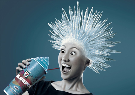
This was created by artist Tim O'Brien.

 This design combines 2 different aspects together. It gives kind of a sense of David Carson with the use of typography and "legibility". The way the composition was split in half is an interesting way to break it up. The left half plays with font and type while the right half plays more with textures.

 I found this design really interesting because it is so simple because it uses only simple lines and shapes but it still get the point across. I also like it because it contradicts what a zebra is supposed to be. They are supposed to be only black and white but this one has all different colors in it instead.


 So this magazine is great, I paint a lot, so it's a great reference and here is some art work that have made the cover...